


Cereal Packaging with Logo: Branding on Every Breakfast Table
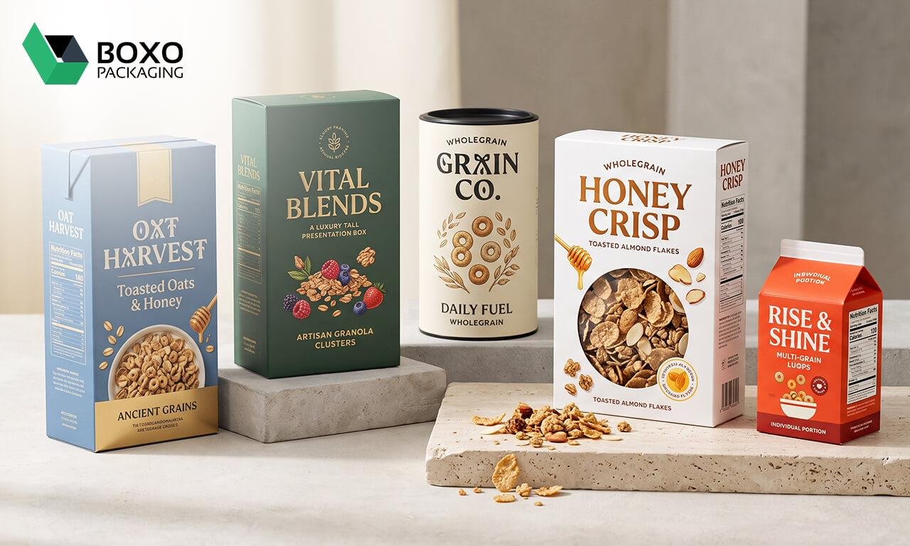
A cereal box sits on a kitchen table far longer than most food packaging, often getting poured from every morning for weeks until the contents run out. That extended presence gives a logo on a cereal box a kind of repeated exposure that most retail packaging never gets, since the branding stays visible in the home long after the point of purchase has passed.
This guide looks at why logo placement on cereal packaging matters beyond the retail shelf, and how brands should approach it for maximum impact.
Why Logo Placement Matters More on Cereal Packaging Than Most Products
Most food packaging gets discarded shortly after purchase, but cereal boxes typically remain in active use in a kitchen or pantry for an extended period, often displayed on a counter or table during actual mealtimes. This creates a second phase of brand exposure beyond the initial shelf decision, one that happens repeatedly in a customer's home rather than just once during a purchasing decision.
Because of this extended visibility, logo design and placement on cereal packaging carries a kind of long term brand reinforcement effect that shorter lived packaging formats do not offer in the same way.
Where Logo Placement Has the Most Impact
A few specific placement considerations affect how much value a cereal box logo actually delivers.
- Front panel placement: the primary logo location, needing clear visibility from typical shelf viewing distance and angle
- Side panel consistency: repeating the logo or brand colors on side panels helps with recognition even when boxes are viewed from an angle in a pantry or cabinet
- Top panel visibility: relevant for boxes stored upright in cabinets where the top may be the only visible surface
- Back panel branding: often overlooked, but a consistent brand presence here reinforces identity for households that read nutritional information while eating breakfast
- Size relative to other design elements: a logo that is too small gets lost among competing visual elements, while one that is too large can overwhelm other important information like nutritional highlights
Brands should think about all four visible panels of a cereal box, not just the front, since actual household use exposes different panels depending on how the box is stored and accessed.
Logo Finish Options and What They Communicate
The way a logo is applied to a cereal box affects the impression it creates as much as the logo design itself. Standard flat printing remains the most common and cost effective approach, suitable for most mainstream cereal brands where clear, consistent branding matters more than a premium tactile finish.
Foil stamped logos add a reflective, higher end quality that some specialty or premium cereal brands use to differentiate from mainstream competitors relying on standard printing. Embossed or debossed logos create a raised or recessed texture that adds a tactile quality, though this finish is used less frequently in mainstream cereal packaging due to the added production cost relative to the high volumes typical of the category.
Building Long-Term Recognition Through Consistent Logo Use
Repeated, consistent logo placement across every product in a brand's cereal lineup helps customers recognize new products or flavor variations more quickly, since the familiar logo signals trust even before a shopper reads the specific product name. Brands that vary logo placement or sizing inconsistently across different cereal products in their lineup risk diluting this recognition benefit, since customers rely on visual consistency to quickly identify a trusted brand among many similar-looking competitors.
Boxo Packaging works with cereal brands to maintain consistent logo placement and color matching across an entire product lineup, which helps preserve the recognition value a logo builds over repeated household use rather than letting it fade through inconsistent application across different products.
Balancing Logo Prominence With Required Label Information
Cereal packaging in the United States must include FDA-required nutritional information, ingredient lists, and any specific health claims clearly and legibly. Logo placement and sizing need to be planned around these requirements, since an oversized logo that crowds out required information creates compliance issues regardless of how strong the branding impact might otherwise be.
Printing Considerations for Consistent Logo Reproduction
Logo color accuracy needs particular attention during production, since even small color shifts in a brand's primary logo color can be noticeable to customers who see the same box repeatedly over an extended period of household use. Requesting a physical color proof and comparing it against an approved brand reference before full production helps confirm the logo reproduces accurately, rather than discovering a color shift only after a large batch has already been printed.
Sustainability Considerations for Logo Application Methods
Certain logo finishes, such as heavy foil stamping or non-paper-based embellishments, can affect the recyclability of an otherwise standard paperboard cereal box. Brands prioritizing sustainability messaging should confirm with their supplier whether their chosen logo finish affects recyclability, and be specific about this detail rather than assuming any logo application method has no effect on the box's overall recyclability.
Common Mistakes Brands Make With Cereal Box Logo Placement
A few recurring mistakes show up when brands design logo placement for cereal packaging:
- Focusing exclusively on front panel logo placement while ignoring side, top, and back panel consistency
- Sizing a logo too small to be recognizable from typical shelf viewing distance
- Allowing logo prominence to crowd out required nutritional and ingredient information
- Inconsistent logo placement or color across different products within the same brand lineup
- Choosing a premium finish like foil stamping without accounting for its effect on recyclability
Working with an experienced supplier such as Boxo Packaging can help cereal brands maintain consistent, well-placed logo branding across their full product lineup, supporting the kind of long term household recognition that cereal packaging is uniquely positioned to build.

 Arabic
 French
 Spanish
 Portuguese
 Deutsch
 Turkish
 Dutch
Dutch
 Italiano
 Russian
 Romaian
 Portuguese (Brazil)
 Greek
Greek